Logos
A selection of logo work

The Client
A logo needs to be simple, memorable and impactful; legible on the side of a van or the corner of an envelope. It starts from an understanding the brand messaging and story, moves on to thumbnail sketches, and goes through many iterations to reach its final form.
Keywords
Visual Identity / Logotype / Branding
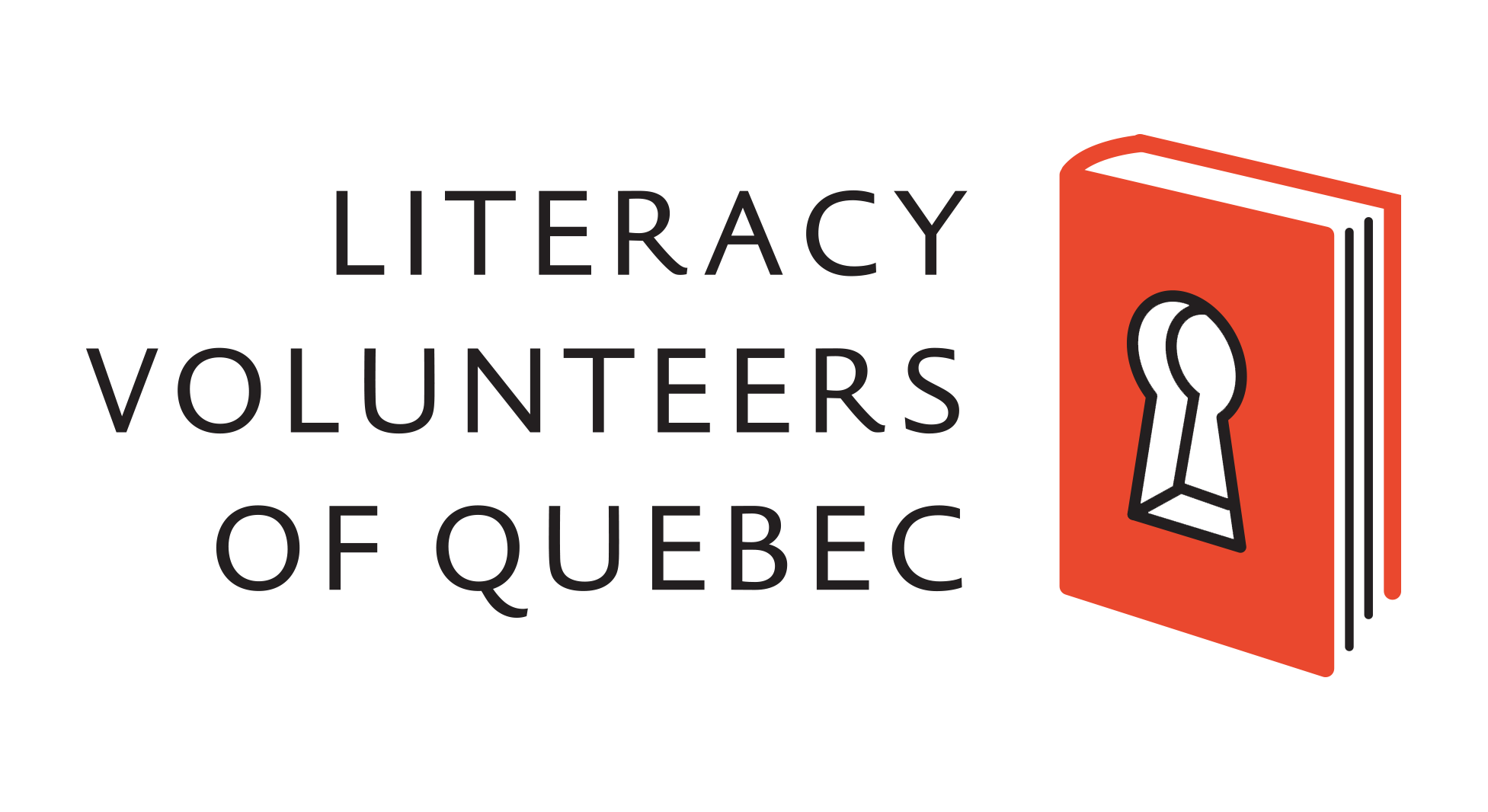
Literacy Volunteers of Quebec
The LVQ chose between many options, for both their brand logo and the Students Unlimited Network. I offered various concepts signifying literacy and the empowerment that comes with it, and connection between clients and volunteers.

The Client
Switch Heat Pumps requested a line-drawing style logo that reflected the common architecture style of century homes in Toronto.
The Client
The band Dryer needed a unique wordmark for use on all of their materials and merch.
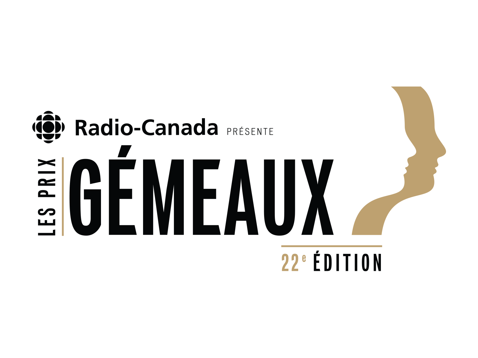
The Client
The Genie Awards requested a modification to their base logo to reflect the presenter and the edition. I carefully balanced the typography to harmonize the visual elements.
The Client
Planex Solutions Financières is an independent financial planning firm based in Quebec. The simple adaptation of the letter A is meant to invoke an open folder, an arrow aiming upwards, the cardinal direction North, and a peak to climb.
The Client
The Montreal client needed a memorable unused English URL, and a wordmark. I researched and copywrote several options for the name of the affiliate site, and the client chose “Sharpfinds”.
The Client
This financial management company wanted a logo to signify their values of integrity and strategy to their clients. I created a logo that referenced a knight chess piece placed on a standard flag that one would carry into battle.
The Client
These logos for a Montreal law firm were part of a series of Decisions based around different areas of law.
The Client
This wordmark logo was created for a dynamic electronic dance musician and vocalist.
The Client
Stelvio is a Montreal software development company. I stylized the S in the company name to denote a road or path in the negative space, signifying the balance and guidance they provide their clients.

The Client
Procoupon used both direct snail mail marketing and email marketing of discounts and coupons for their B2C business clients. They needed a new logo and web design for the new digital aspect of their marketing business.
The Client
This professional organization of independent financial advisors needed a logo to reflect their cooperation, stability, reliability and interconnectedness. These are some of the versions I provided.
© 2026. Peggy Messing. All rights reserved.
site layout + build by Peggy Messing