Switch Heat Pumps
Art direction + design + illustration
The Client
Switch Heat Pumps is a Toronto business that educates and sells clients on the benefits of using heat pump technology to replace traditional oil and gas furnaces and air conditioning. They initially wanted a logo in an illustrative style, but later pivoted to preferring a more simplified image that showed a heat pump more clearly. Here I show some of the many stages the logo design went through, based on the client's feedback, to reach its final form.
Keywords
Art Direction / Design / Moodboard / Visual Identity
Iterations
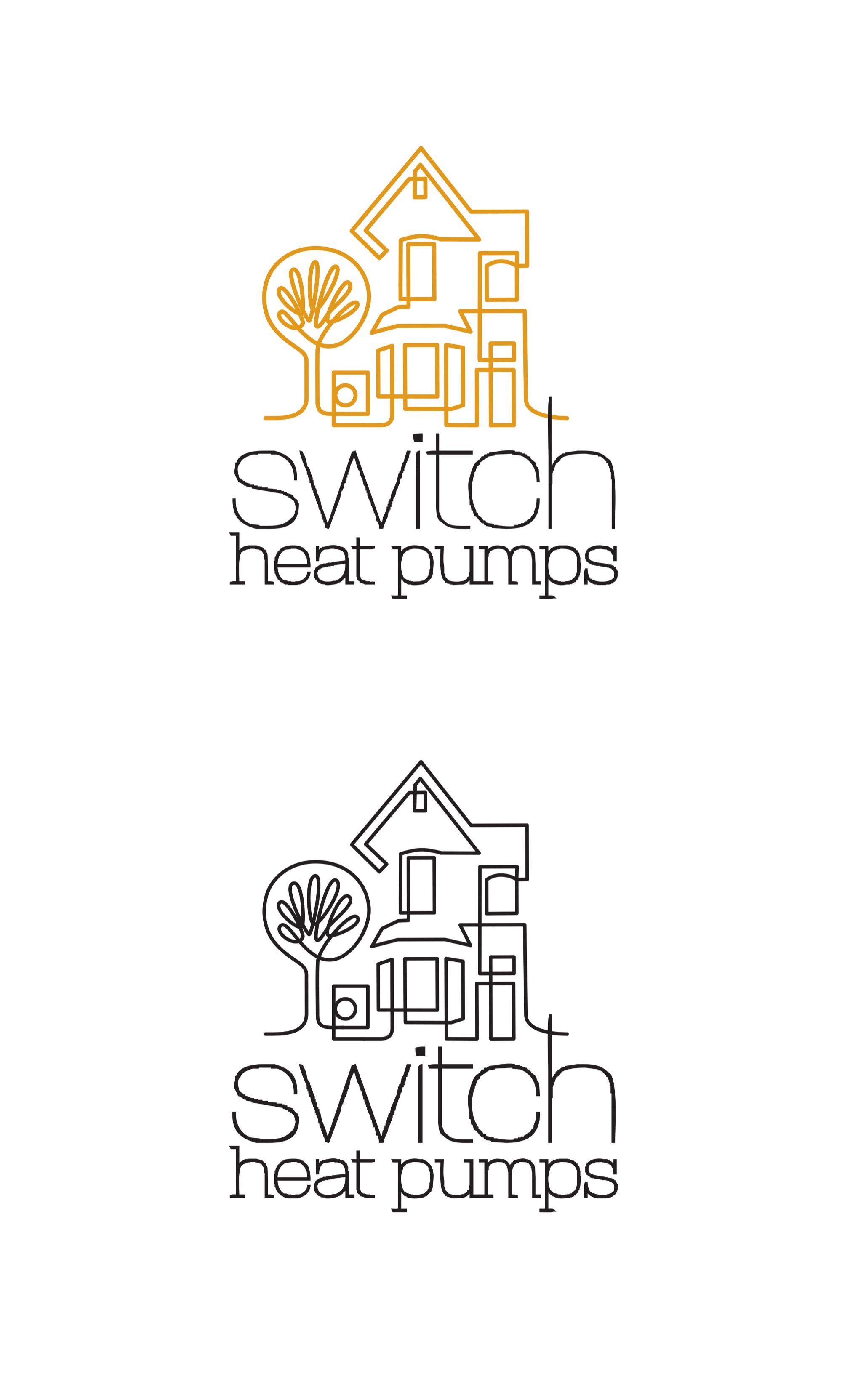
Sometimes we need to try things to know what we don't want. Initially the client asked for a whole street scene in their logo, drawn in this linear style. However it became obvious that this would not work as a logo because it was far too busy and detailed. We then began the process of paring down.
I tried several typefaces to see what would marry well with the style of drawing.
Keywords
Art Direction / Design / Moodboard / Visual Identity


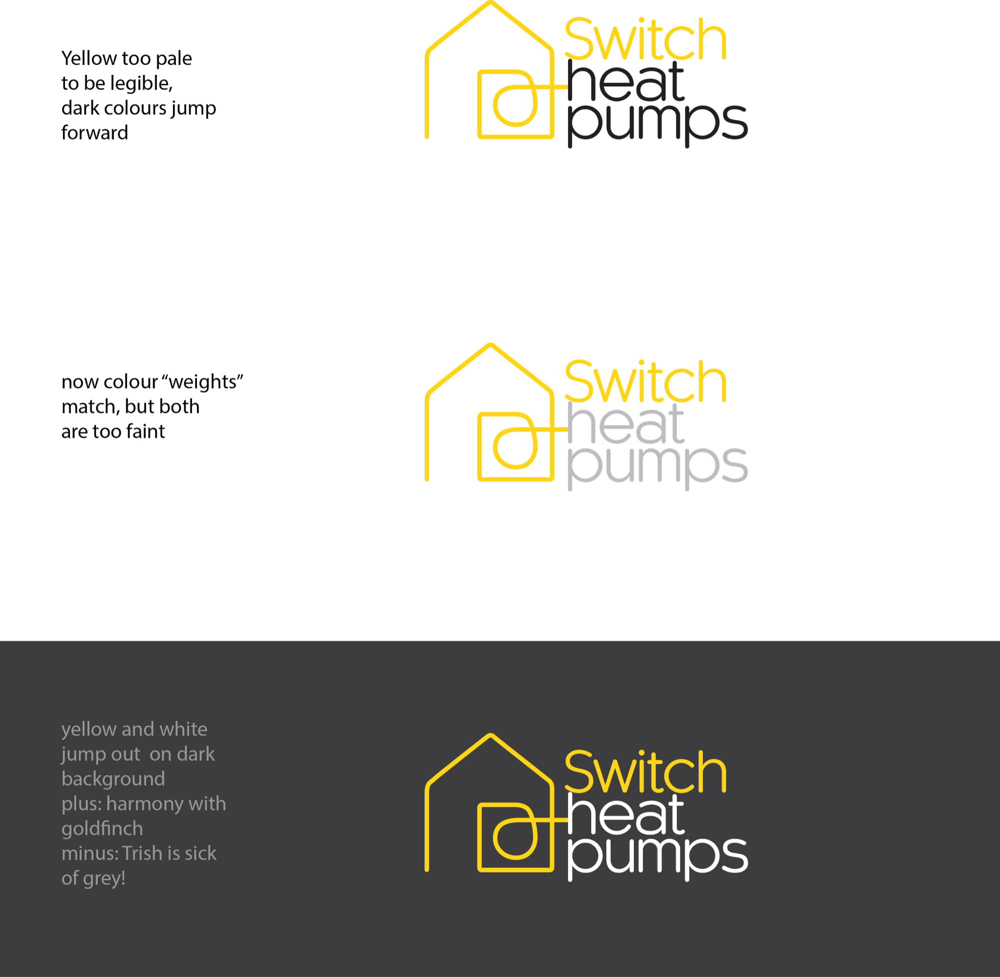
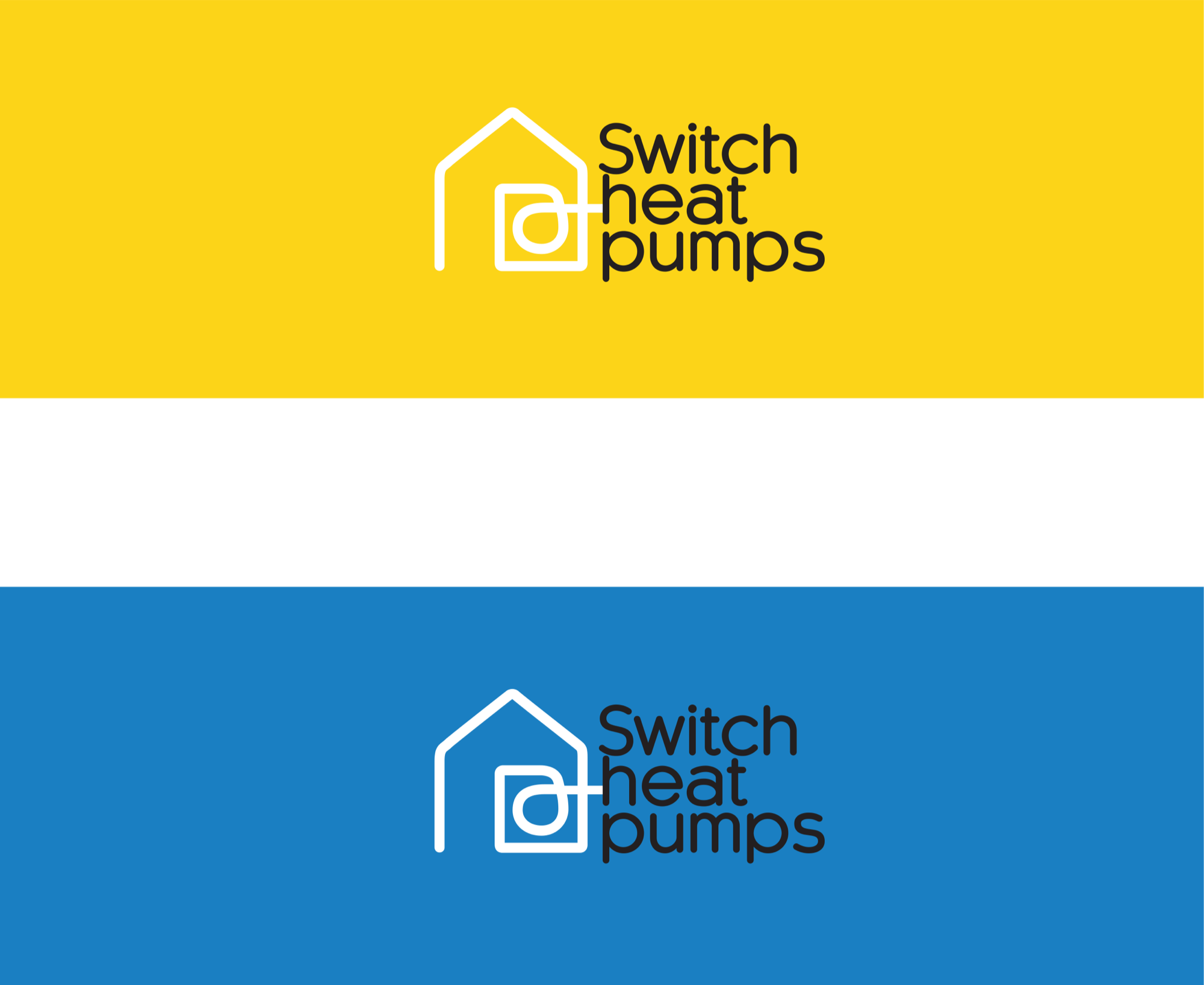
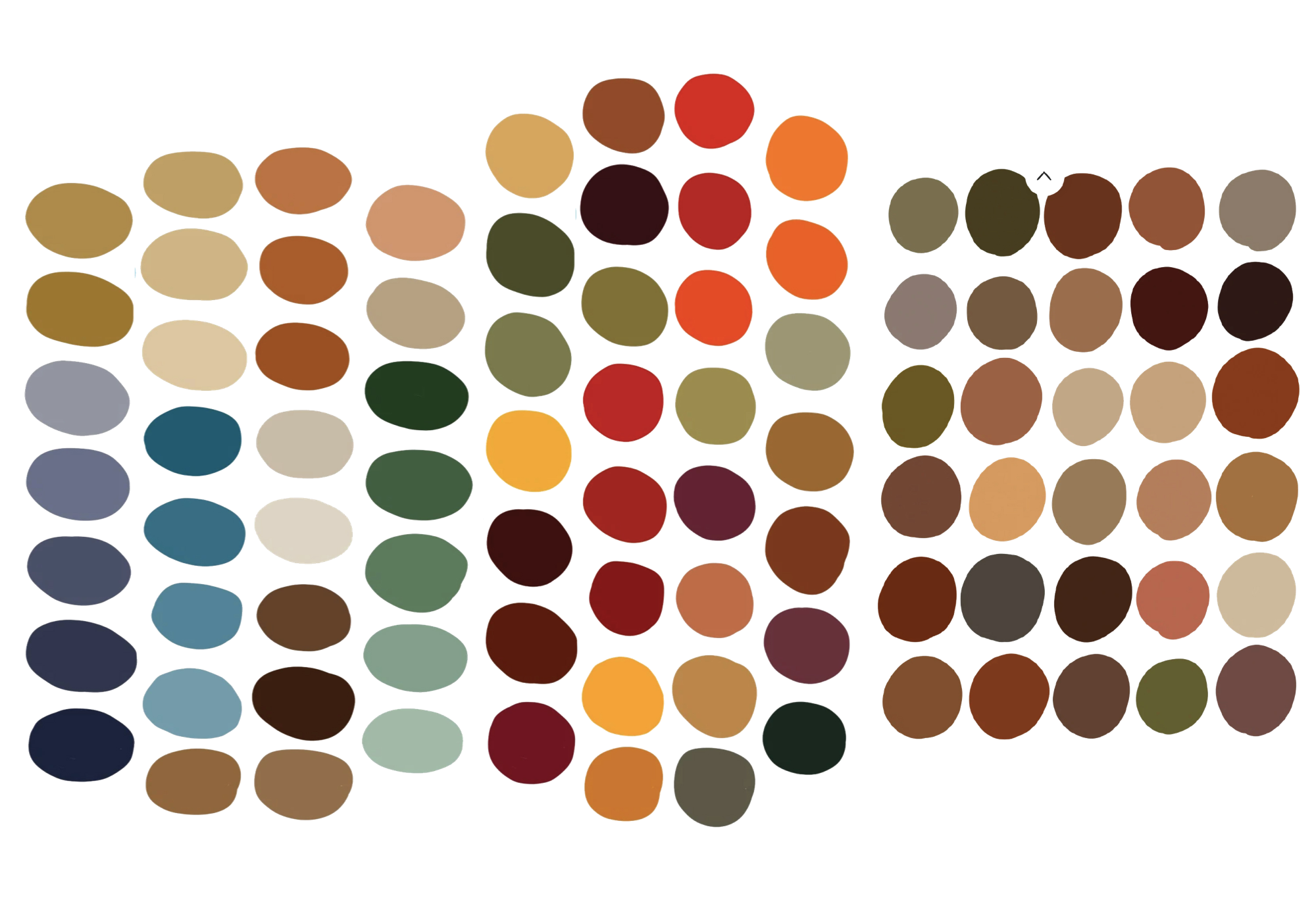
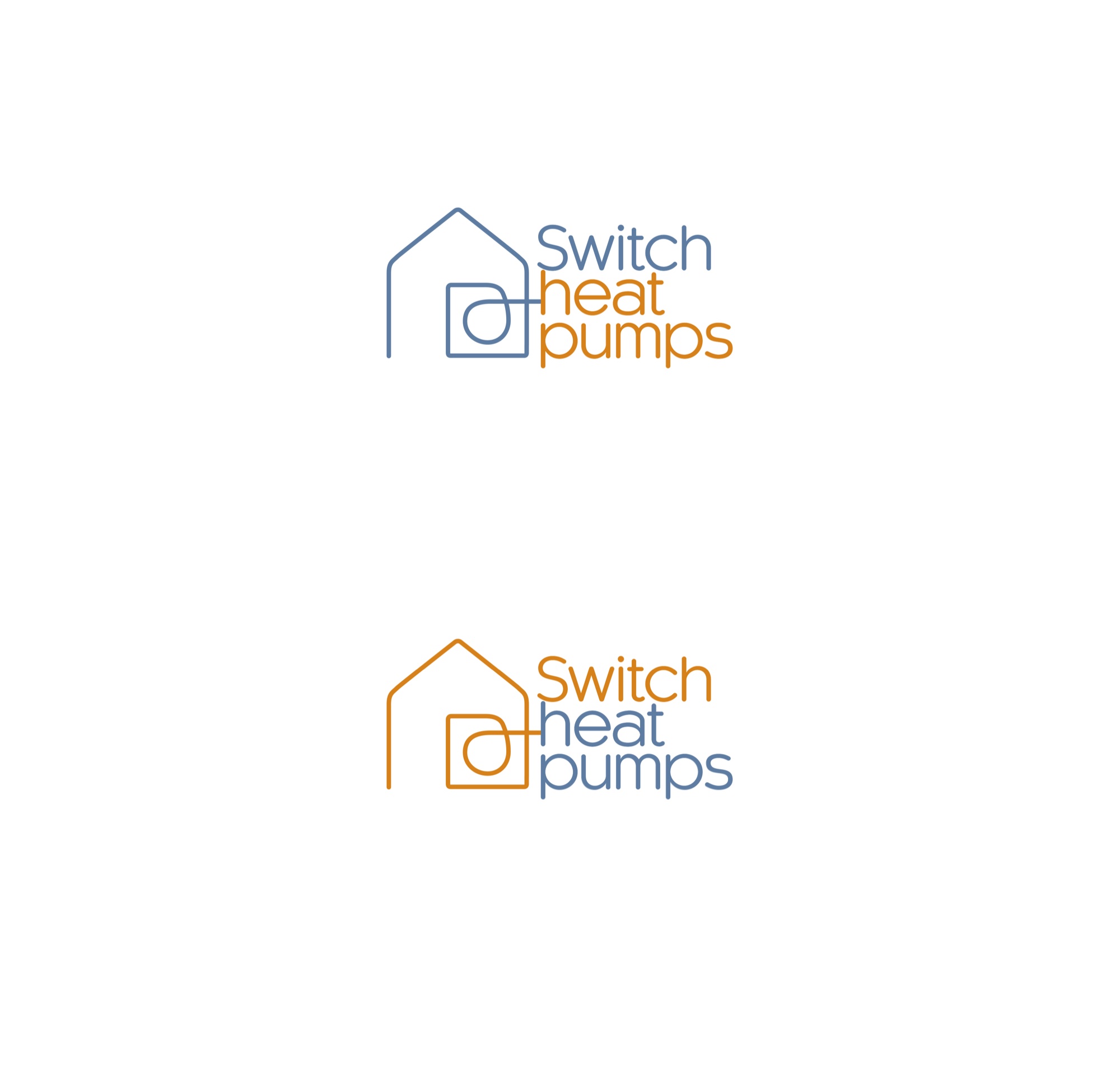
Colour
The client had a sister business that used grey and yellow as its brand colours. We experimented with these but found them too soft. They ultimately went with the stronger orange and blue colours which were more eye catching, as well as not seeming too subtle and expensive.
Keywords
Art Direction / Design / Moodboard / Visual Identity


The Brand
Branding and logo design is a balance between listening to and understanding the client's needs, and advising and guiding them to what works best. Sometimes the challenge is to give them the thing they want, even if it's not the one that was your favourite, because ultimately it's their business that matters.
Keywords
Art Direction / Design / Moodboard / Visual Identity

© 2026. Peggy Messing. All rights reserved.
site layout + build by Peggy Messing